|
Even though I'm color-blind, I do like maps - as most people's minds are built to aunderstand structures and geometries, they are by far the easiest way to represent thought processes - regardless to whether geography was actually involved (mind maps etc).
Maps are also a great way to showcase humor - intentionally and especially unintentionally. There are also these 17 odd archived maps here. |
LINZ Releases National Building Footprints (28th July 2019)
|
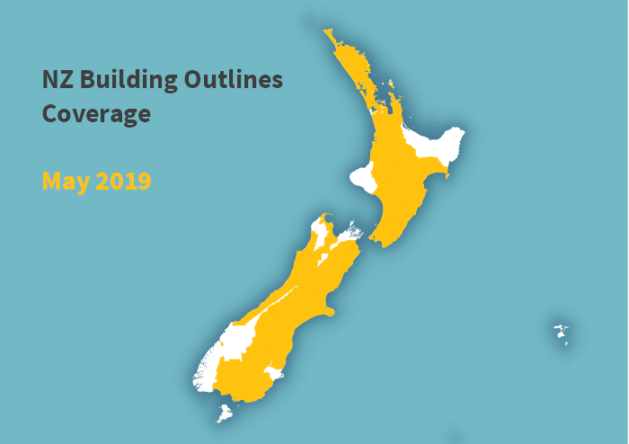
LINZ has released footprints for most of the buildings in New Zealand. You can see the current coverage in the map on the right. By 2019 whole of North Island and the Marlborough will be covered making it some 99% of the population. It is expected that rest of the South Island will be covered by the end of 2020.
This is a series of 3 open datasets that can be downloaded form LINZ Data Service. One of those datasets is a life cycle dataset, allowing comparison across time between building sets. Well done LINZ! Here is the original article. |
|
What is the True Size of Your Country? (5th September 2015)
|
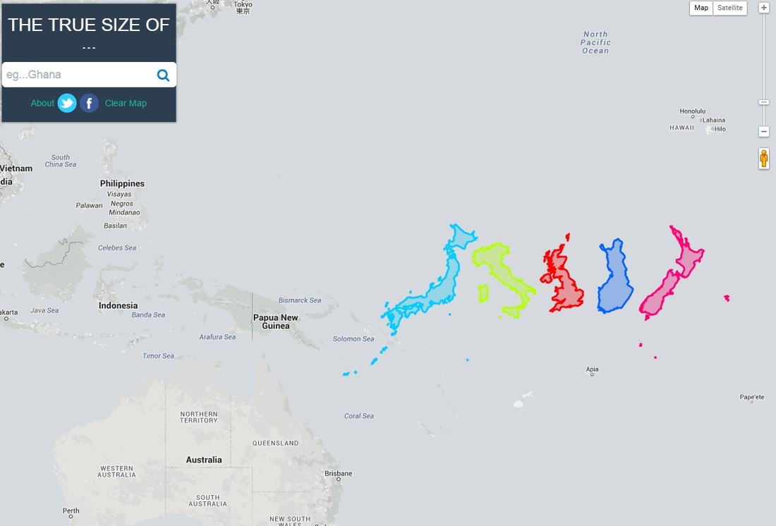
Did you realise how much the modern maps actually distort the countries when you move further away from equator - you might be surprised!
There is a map website that allows you to move your country beside another country on the map so you can see the actual sizes easily. On the image left I moved Japan, Italy, UK, Finland and New Zealand side by side at the equator - the one that surpri9sed me was Finland and it is because it is so far North that it is distorted to look a lot bigger than the countries further to south. To use the tool click here. |
Chrome Experiments - Artist Concerts (2nd September 2015)
|
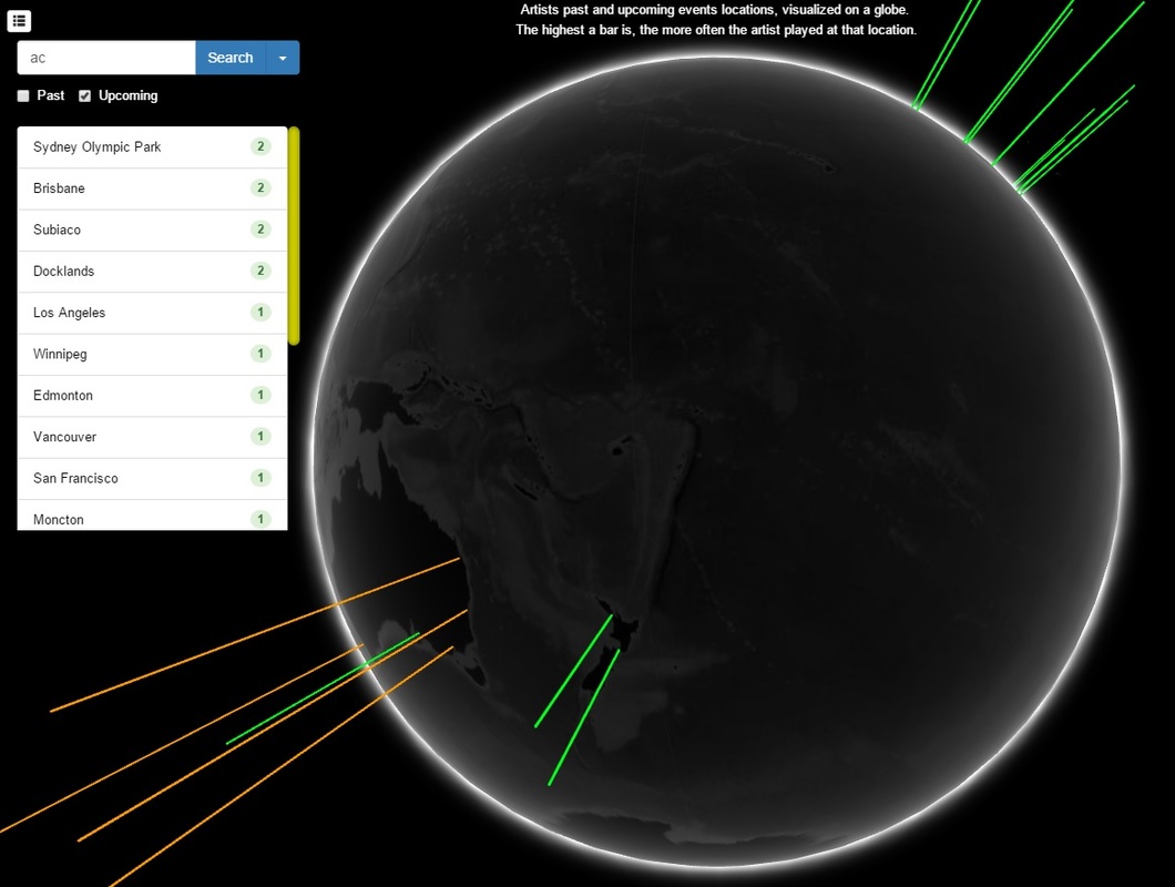
This brilliant Chrome WebGL experiment shows a dark globe that you can see selected artist's concert locations for past or future.
Just start typing the name of the artist you are interested on, 2 or 3 letters and wait for it as the search is a bit dumb so you are better of selecting from a list it offers. Height of the bar tells you how many times artist has played (will play) on that location. The list of artist visits is based on number of visits. Neat little experiment and you can find it here. |
|
Norse - Live Attack Intelligence - IPViking (26th February 2015)
|
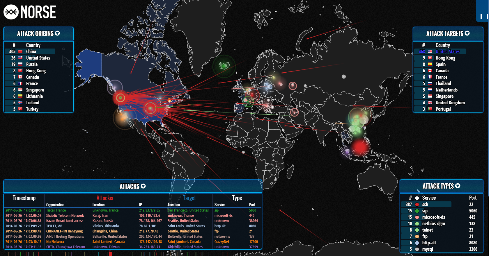
This is one of the coolest demonstrations of how internet security threats affect different countries; it is kind of like the old movie Wargames - it shows the threats origin on a map (attacker) and who they attack against (kind of like missile flying from one country location to another).
All sound live and bigger the bubble on either end (source or target) the bigger the threat sent/received. From company called NORSE and here is the live demo for your pleasure! |
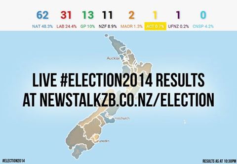
New Zealand Election 2014 Live Results (24 September 2014)
|
New Zealand just had the elections and exciting as they were to watch in tv, I just found that there would have been a lot better way to view the live results - via this nifty web page here.
You see the national results on top of the map with the percentage complete (100% of course now). On the left you can select party vs candidate votes and even the previous election for comparison. You pick your electorate either from a list or from the map or just one of the 3 major cities map. Candidate and party vote results are shown on bar charts. If you know your polling booth, you can even view the results specifically to that booth. How cool is that! |
Maps Have Always Been Business Intelligence (30th August 2014)
So where did it all start with maps - what were the first published maps like and were they used for anything else than guidance/routing? Or was there actually some location intelligence in use long before realtime dynamic mapping was available?
The answer is yes to both questions - maps have always been used to showcase geographical aspects of business intelligence. The following 8 map images are examples across the time why this is so. You can also view the original web site here.
The answer is yes to both questions - maps have always been used to showcase geographical aspects of business intelligence. The following 8 map images are examples across the time why this is so. You can also view the original web site here.
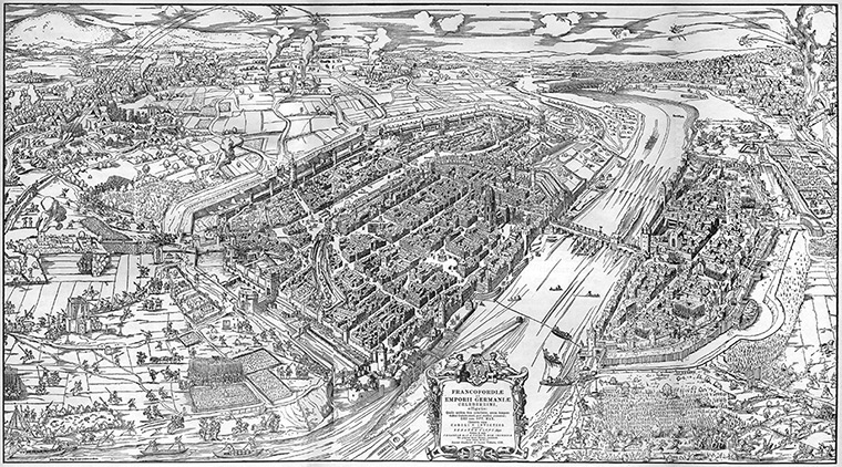
1552 - Germany, Siege of Frankfurt - 3D map on battalion placements and ballista targets (on important buildings).
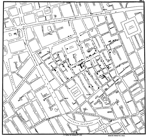
1854 - England, the cholera outbreak and John Snow's proof that water pump in Soho started it all. This was the first time map was undoubtedly needed to solve a problem.
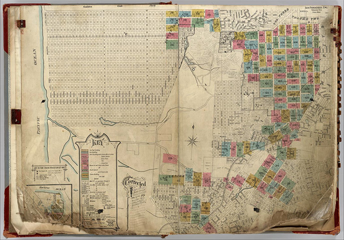
1887 - US, San Francisco building map for insurance to show color coding on proximity to nearest neighbour & fire department and what building materials were used.
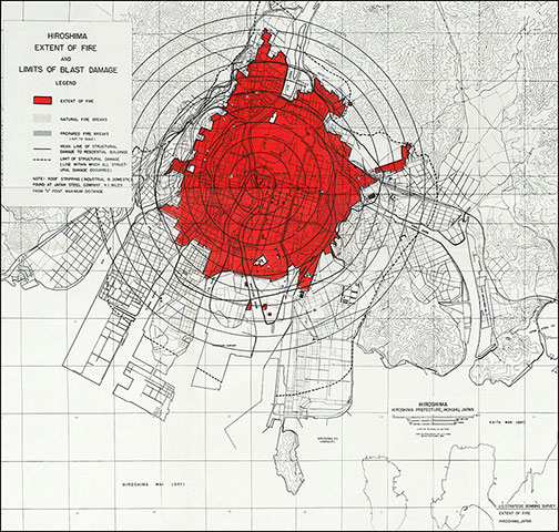
1945 - US, the damage by atom bomb to Hiroshima - red shows blast area, grey the damage by fire.
|
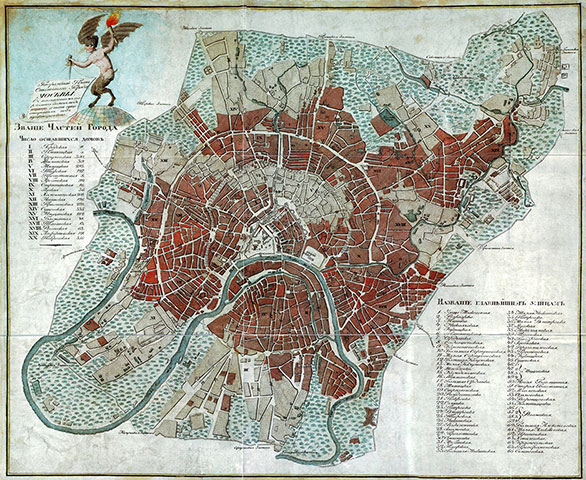
1812 - Russia, the great fire of Moscow and what city blocks were burned. I have to wonder if the different color shading has a meaning too?
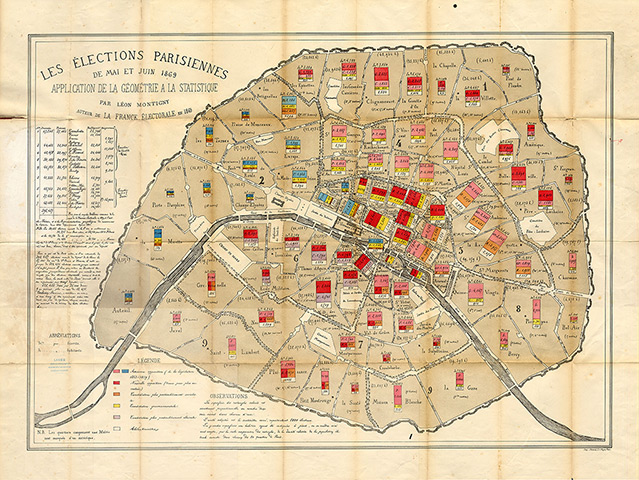
1869 - France, Paris and the first time bar charts were used on map to show voting results. Napoleon's votes were shown in yellow color (not good news for Napoleon).
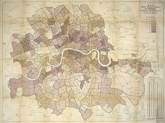
1891 - England - the very first deprivation (poverty) map by Charles Booth. Darker the shading, the poorer the area.
1941 - Germany, the bombing targets within UK cities down to the building level.
|
You can see 17 archived maps here.
