|
I love maps of all kinds, my job is around geographical maps, but mind maps and clever implementations are often almost better. And not forgetting that maps can be fun too, there are some superb maps that can be (intentionally and unintentionally) funny. I also occasionally include other images here that are somehow geospatially relevant.
|
|
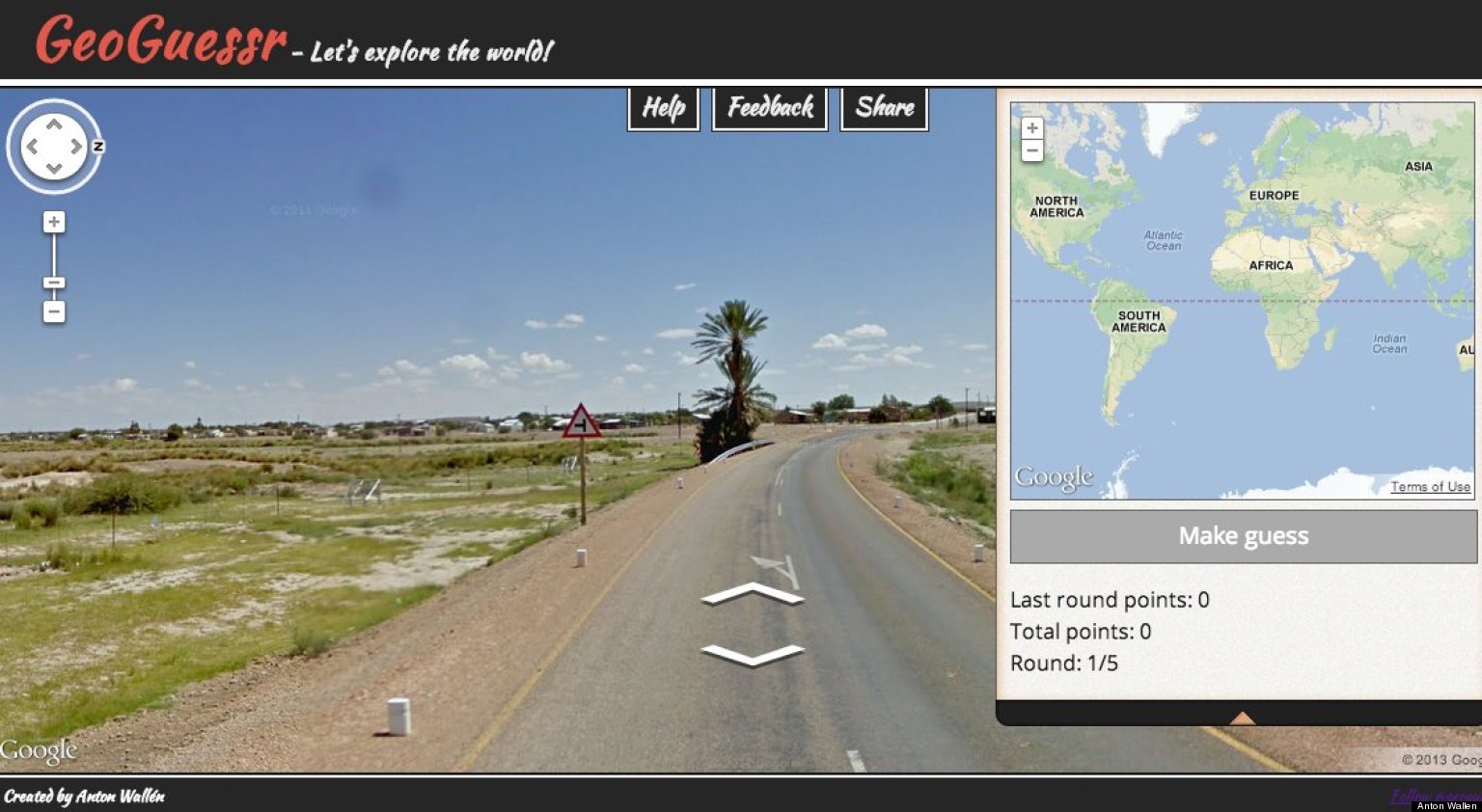
GeoGuessr - Geographical Trivia Game (4th March 2014)What a brilliant little game this is - guess where 5 places provided to you via Google StreetView are using the little Google Maps interface. The closer you are the higher the points.
Harder than it looks, but with a bit of practice you start figuring it out. Managed to score 10,500 with my last attempt - BEAT THAT! The game can be found here. |
|
Disney's Revolutionary Touchscreen (31st October 2013)Disney has created a touch screen that touches back - using electronic currencies it responses your fingers to feel bumps and ridges when moving your fingers on top of screen or even when a video is running underneath.
I believe this technology is only one of the first of it's kind - and could be really useful for wide variety of things; 3D mapping comes first to my mind (me being a geo-geek), but it is easy to see how this could help people suffering of poor vision, introduced as new type of peripheral gaming industry etc. |
|
Global Unique Location ID by What3Words (25th September 2013)
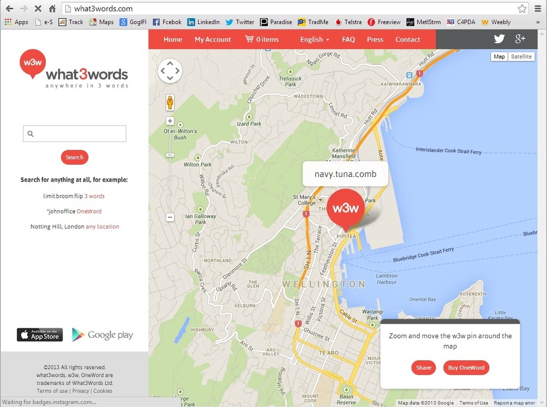
Sometimes you find the weirdest things, please look at an app called What3Words.
It uniquely names all locations in the whole wide world using random 3 words. So for example my address in Wellington is called "rail.spell...." - I left the last word out as otherwise I would be announcing my address to the world :)
The words are truly random, so the first 2 words do not mean a specific area in the world, for example "rail.spell.smile" is in US middle of Connecticut River, and "rail.spell.crazy" takes you to Nottingham, UK.
There are some funny combinations too - I feel sorry for the person living in Gloversville US whose address is "twice.large.crazy", but mostly there are no (really) naughty combinations - I did find "formless.barmaid.decisive" though ...
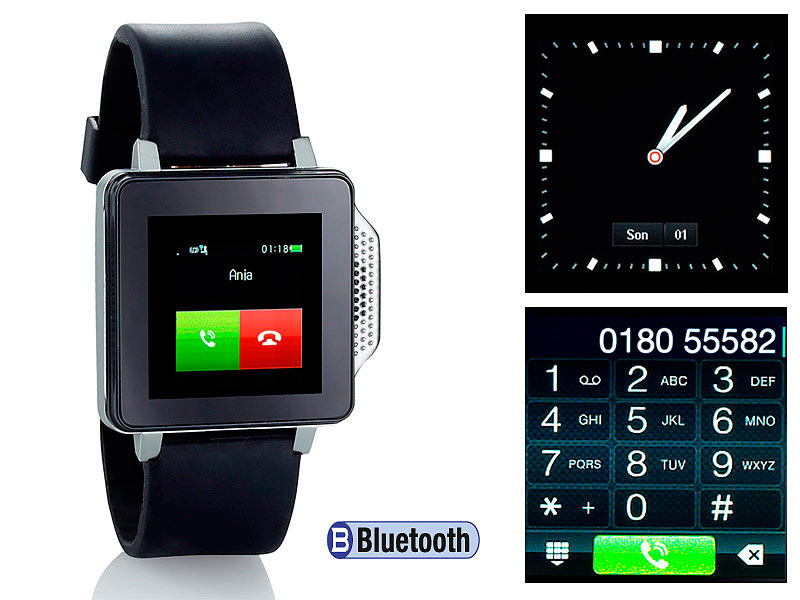
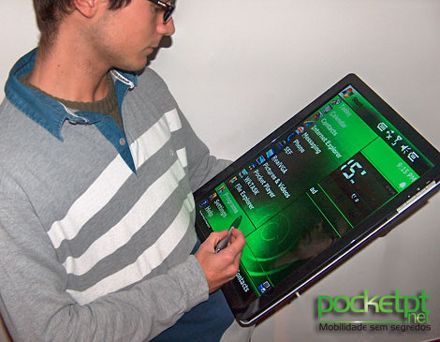
Mobile Devices - Two Extremes (13th April 2013)
All mobile devices are created equal, right? Wrong, below are two extremes I've found:
|
|
The true size of Africa (29th January 2013)
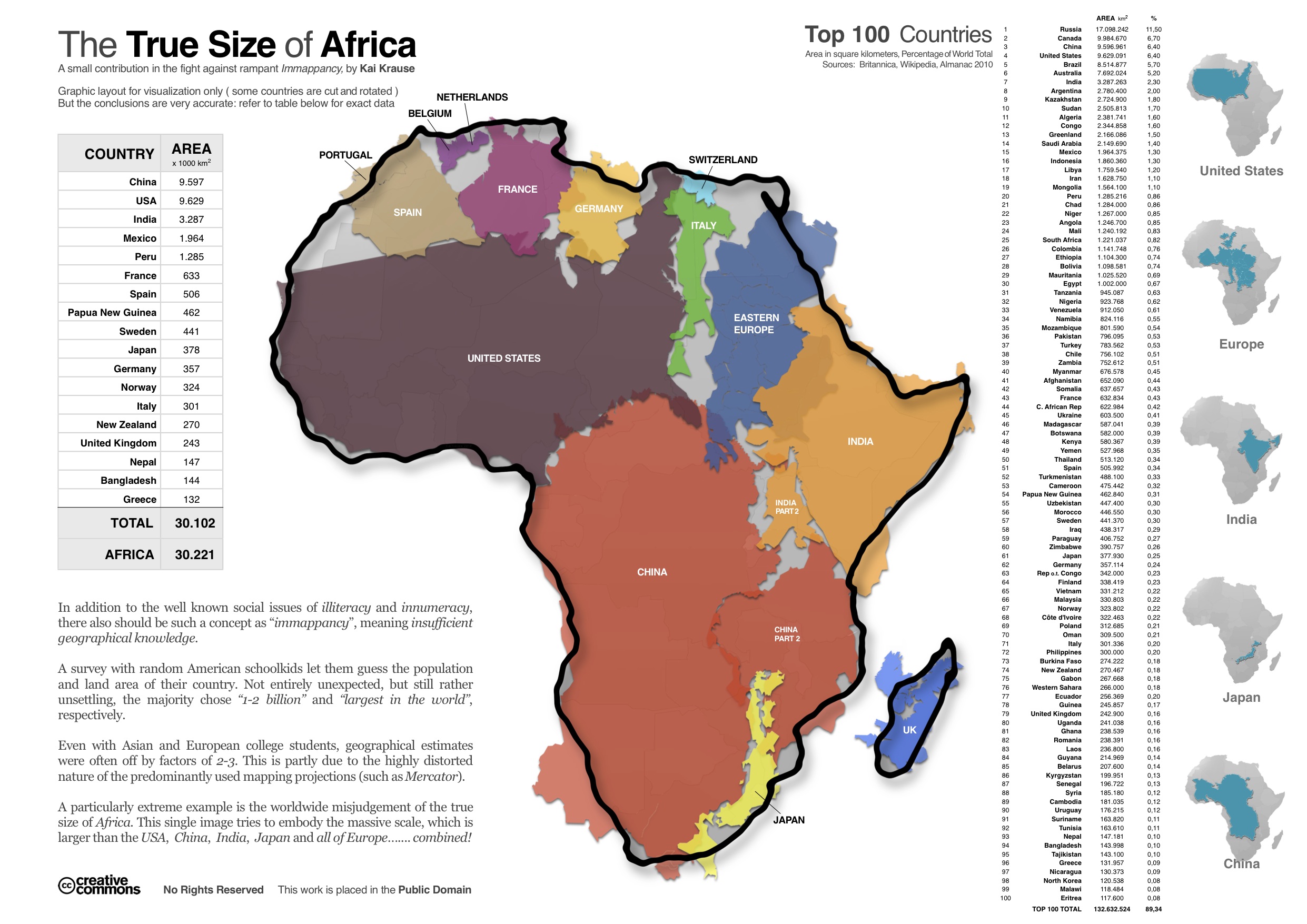
When viewing the continent of Africa against Google Earth and Google Maps, it does not look that much bigger than US and China, but in reality Africa is huge.
The map on the right takes several other countries and embeds them into Africa map boundaries, showing the true size.
Africa is huge folks, the original article also here.
The map on the right takes several other countries and embeds them into Africa map boundaries, showing the true size.
Africa is huge folks, the original article also here.
The biggest tech (digital) acquirers (26th September 2012)
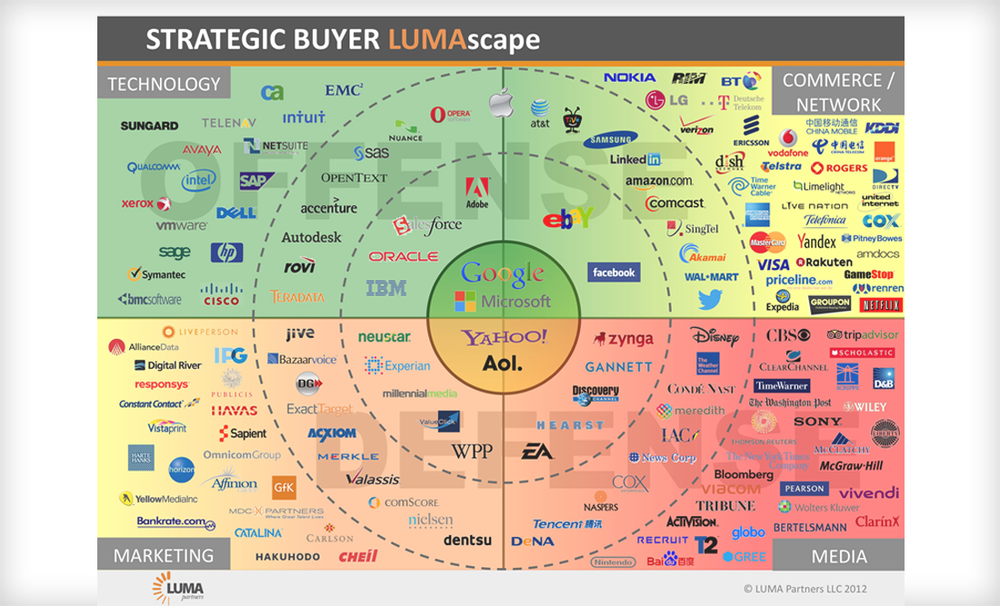
This image graphically depicts all the likely strategic buyers of digital start-ups. Middle circle includes the historically relevant players, still relevant today but less so as 150 others now buying too. Original article here.
This is how you read the image:
This is how you read the image:
- Buyer Type in 4 corner quarters – media, marketing, technology and commerce/network.
- Propensity (dotted circles) – the closer to the center, the more likely a buyer of digital assets.
- Capability (color on quarter) – the buyer’s capacity to make sizable acquisitions (Green > Yellow > Red).
- Motivation/Strategy – offense or defense denote the generalized motivations of the sector buyers.
Envisioning emerging technologies from 2012 to 2040 (24th September 2012)
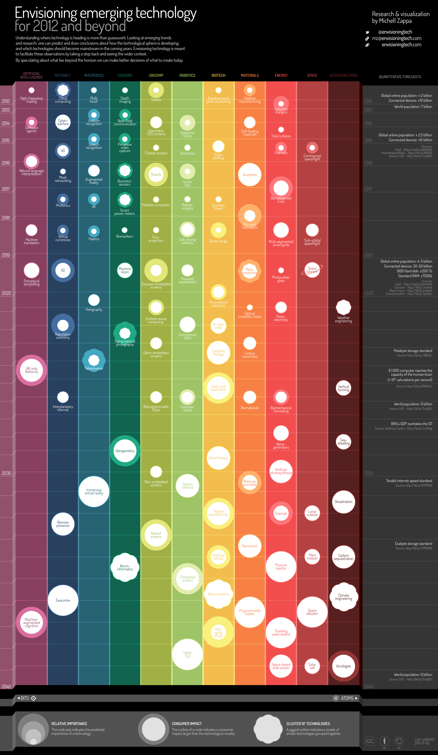
Emerging technology strategist Michell Zappa shows some results from his technology trend forecasting studies. He covers predictions for almost 30 years within the following technology groups:
He also shares some fascinating quantitative forecasts on population, online population, memory and storage size and on number of connected devices, processor complexity etc. View the whole article and interactive table here.
- Artificial Intelligence
- Internet
- Interfaces
- Sensors
- Ubiquitous computing
- Robotics
- Biotechnology
- Materials
- Energy
- Space
- Geoengineering
He also shares some fascinating quantitative forecasts on population, online population, memory and storage size and on number of connected devices, processor complexity etc. View the whole article and interactive table here.
GeographX wins A-PAC Gold for best map in show (25th August 2012)
GeographX, one of the great mapsmiths in New Zealand has won two gold medals in 2012 International Map Trade Asia-Pacific Map Awards in Brisbane. First gold was for best map sheet and the second gold was for the best in show.
Great success for small New Zealand company. The interactive map can be found here.
Now it has a chance to win Best in World, going head-to-head against two other winners: the best of Americas and the best of Europe/Africa. Wishing you luck GeoraphX!
And it is a really cool interactive map too.
Great success for small New Zealand company. The interactive map can be found here.
Now it has a chance to win Best in World, going head-to-head against two other winners: the best of Americas and the best of Europe/Africa. Wishing you luck GeoraphX!
And it is a really cool interactive map too.
Mapping London 2012 Olympic medals per country (7th August 2012)
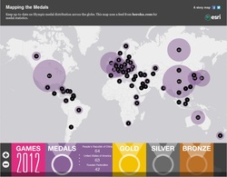
Another great Esri story map has been published - this one is about Olympic medals. By default map shows number of all medals per country, but the banner on bottom of the map with labels for "Medals", "Gold", "Silver" and "Bronze" can be used to see only the relevant medal numbers. Size of the circle on top of your country shows is relevant to number of medals, but medal count is also shown inside the circle. Clicking on the circles take you to the London 2012 Olympic website specific to that country.
Needless to say we Kiwis prefer the "Gold" option as our circle (and medal count) is slightly larger than Australian circle, not bad for country with 4 million people. Go Kiwis! And Go Esri for giving us easy to use tools to view these (very) relevant statistics.
You can get to that website by clicking on this link (or on the map image)
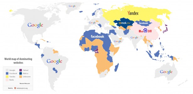
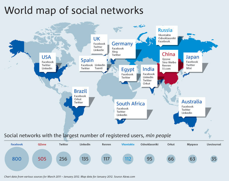
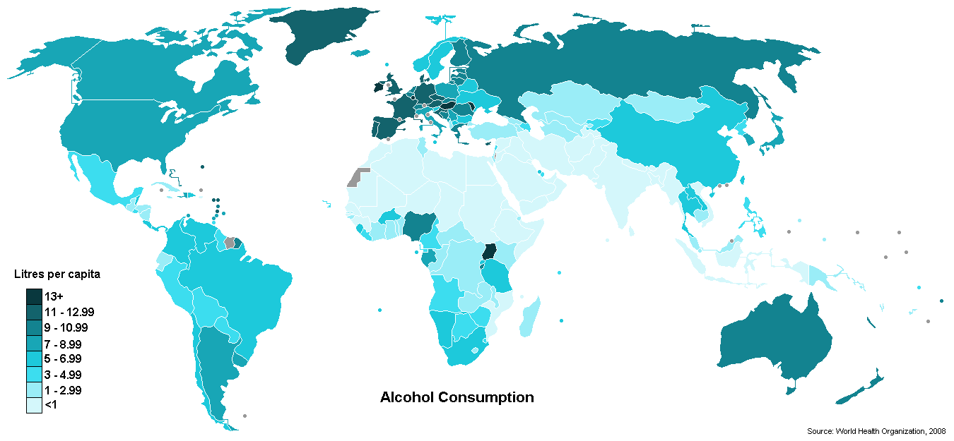
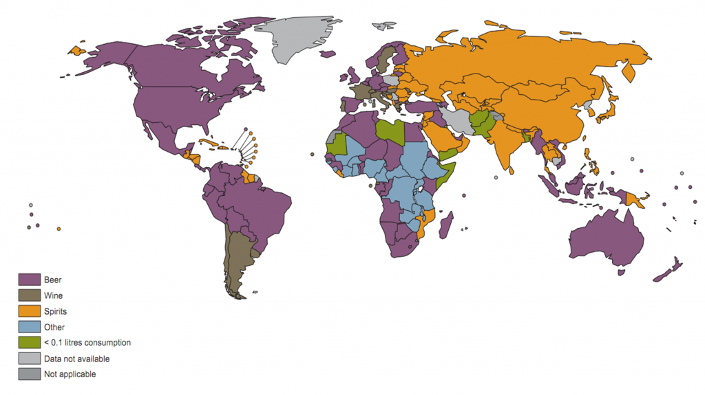
Important statistical maps for 2012? (10th June 2012)
4 interesting maps for 2012; 2 on social networks/websites, 2 on alcohol drinking:1. A map of the planet's most visited websites by country
2. A world map of social networks per registered users per population
3. A map to show which countries drink the most alcohol in the world
4. A map to show what are the most popular alcoholic drinks in the world
2. A world map of social networks per registered users per population
3. A map to show which countries drink the most alcohol in the world
4. A map to show what are the most popular alcoholic drinks in the world
|
|
|
|
Creativity with Geo-Design (31st May 2012)
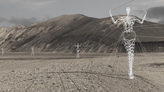
Sometimes an image captures your imagination in such a way that you just cannot let it go and have to share it. This is what happened to me when I saw these electricity (power pylon) assets. In Iceland rather than creating the ugly old pylons, an artistic engineering company was asked to create something more visually pleasing. So they came up with these "Giants" across the Iceland landscape.
These have been created in various themes like "Land of Giants" and "Sense of Place", take around same amount of material than the old ugly ones do and are a lot more pleasing to eye. Hope this is a trend that continues within other asset management sections too. See the original article here.
These have been created in various themes like "Land of Giants" and "Sense of Place", take around same amount of material than the old ugly ones do and are a lot more pleasing to eye. Hope this is a trend that continues within other asset management sections too. See the original article here.
Using 3D maps for crime analysis (thematic shading) (27th May 2012)
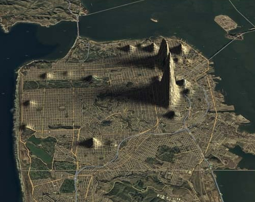
I've been looking for a while on how 3D could be used to present maps in such a way that the map is actually informative. In most of the cases 3D does not work as objects elevated deem to hide other objects behind them.
However this website has found a way to do thematic hot spots in such a way they are quite informative and look real good. They have played with several different types of crime maps and hot spotted them using elevation models on top of San Francisco city maps.
Note that although these maps from viewing perspective work, they still do not add anything useful via using 3D - normal hot spotting would have worked perfectly fine (and probably better) too.
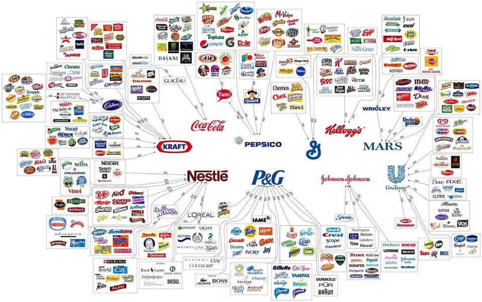
Illusion of Choice
|
|
Google Satellite Imagery - Accidental or Made? (27th April 2012)
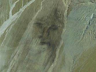
Google collects a huge amount of satellite imagery from all over the world. Some of this imagery includes some fascination photos, most of them built by people, but some by nature. This site collects some of these photos together.
My favorites are #3, #24, #32, #52 and #55 as these seem to be have made by nature or accidentally by people. Also look at #15 - the flying car, or is it a UFO (kite?), I suppose we will never know.
My favorites are #3, #24, #32, #52 and #55 as these seem to be have made by nature or accidentally by people. Also look at #15 - the flying car, or is it a UFO (kite?), I suppose we will never know.
Countries Favoring Heavy Metal Bands (25th April 2012)
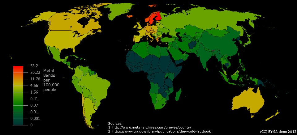
I love my heavy metal - it is pretty much the only type of music I listen every day.
Finally a map has been produced that joins my love for this type of music and my love of maps. Interestingly you can see that Scandinavia really favors heavy metal more than any other countries in the world.
Finally a map has been produced that joins my love for this type of music and my love of maps. Interestingly you can see that Scandinavia really favors heavy metal more than any other countries in the world.
Forest Lungs (22nd April 2012)
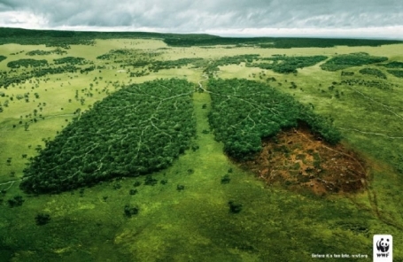
Obviously a man-made picture, but such a clever and thought-provoking idea.
World map according to Idiots (Rednecks?) (21st April 2012)
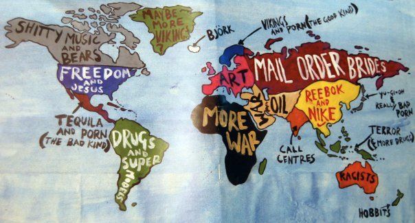
Some clever ideas on labeling, but not all of it works. Still the best of the lot. More (if you are that way inclined) can be found in here.
You can see (0/0) archived maps here.
