HANA and Harnessing the Power of Spatial – the What, the Why and the How? PART 3
HANA is not just a powerful in-memory database - it is also natively spatial now, powering analysts with standards-compliant spatial queries and tools from spatial industry to access and manipulate spatial data. The WHEN is now and we will dive into the WHAT, WHY and HOW of spatial in HANA to empower your team with the power of spatial!
Spatial Examples
Spatial is used everywhere from business intelligence and enterprise reporting, to trend analysis and retail outlet planning. To better understand how HANA Spatial works and what it can be used for, we should first look at some examples of what Spatial can be used for on this context.
Retail industry has used Spatial for years now to analyse what kind of customers their outlets have, how the outlets are doing and whether they could do better if located somewhere else and also to help decide where new outlets should be located (or whether there is a need for additional outlets in the first place).
Consider the below set of analysis maps:
|
|
|
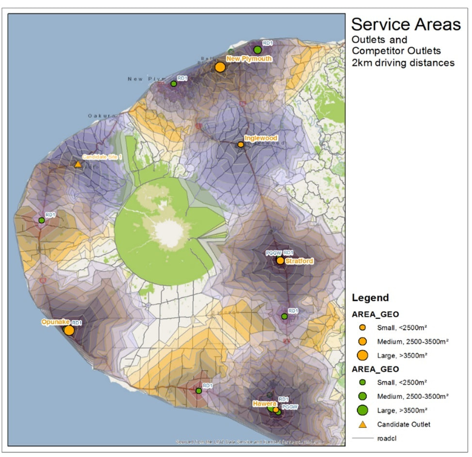
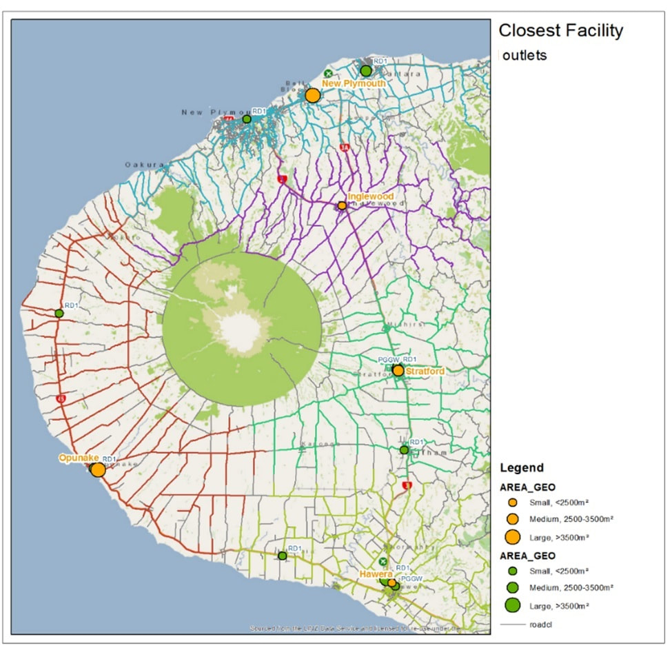
The first map shows our outlets (5 orange circle symbols) and their competitors (8 green circle symbols). There are 3 sizes for the symbols signifying the floor size of the outlet; the smallest outlet (Inglewood) is less than 2500 m2 outlet, the medium size Stratford is between 2500-3500 m2 and largest outlet Opunake is over 3500 m2 floor size. The grey bands around our outlets are all 2 km driving distances – making the outermost (band 8) some 16 km from the outlet using roads (not crow-fly). We can see a little bit of overlap between Inglewood and New Plymouth (making them benefitting sites) but otherwise outlets are quite well separated.
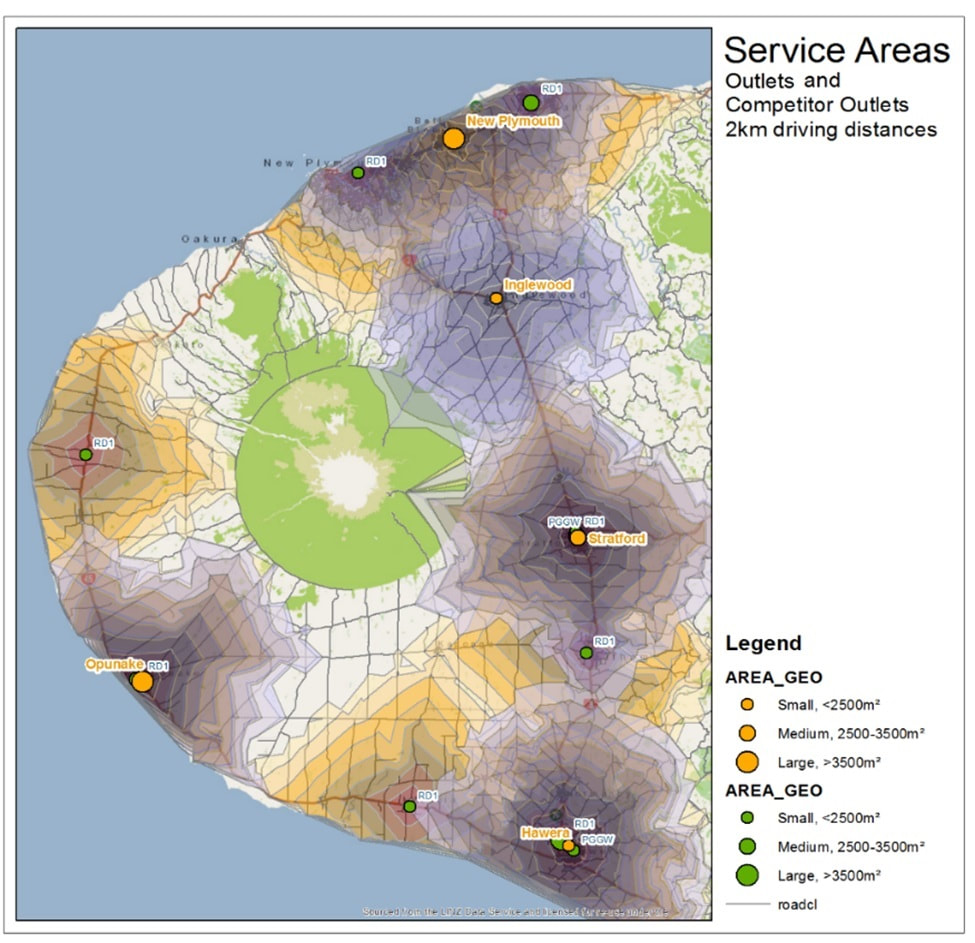
The second map brings in the orange competitor bands using the same 2 km driving distance bands. There is a lot more competition overlaps visible – all 4 larger outlets Opunake, Hawera, New Plymouth and Stratford are quite saturated with competition. We can also see that the competition is picking up a lot of area outside of our bands.
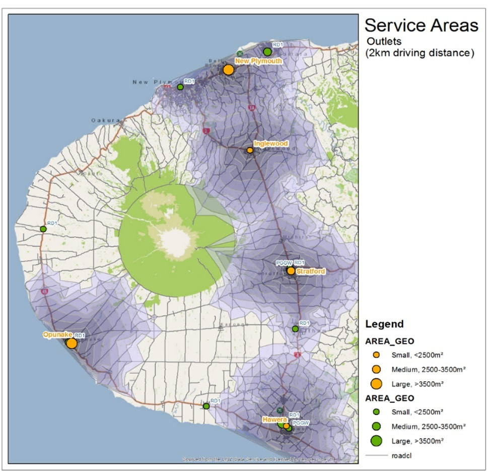
The third map is a consideration on how a new candidate (orange triangle symbol) site’s driving time bands would look – we can see that we would be covering quite a lot of new ground, but also competing quite heavily with a competitor site.
Now let’s look at a little bit more analysis on these outlets:
The second map brings in the orange competitor bands using the same 2 km driving distance bands. There is a lot more competition overlaps visible – all 4 larger outlets Opunake, Hawera, New Plymouth and Stratford are quite saturated with competition. We can also see that the competition is picking up a lot of area outside of our bands.
The third map is a consideration on how a new candidate (orange triangle symbol) site’s driving time bands would look – we can see that we would be covering quite a lot of new ground, but also competing quite heavily with a competitor site.
Now let’s look at a little bit more analysis on these outlets:
|
|
|
|
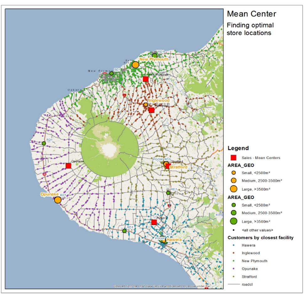
The first map color-codes the roads based on the closest of our outlets. This is to show us areas that have a long distance to drive to the outlets, for example Opunake (red road outlines) has potential customers that have to drive a really long distance to come shopping, whereas the other 4 outlets are quite a lot better. The Opunake driving distances seem to support the candidate site location logic – that specific area in the map is clearly in need of a new retail outlet.
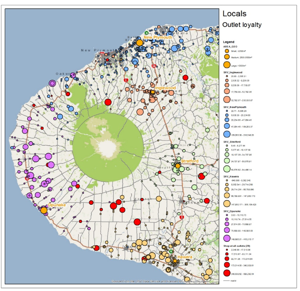
The second map is used to depict outlet loyalty; shopping is colour coded separately for all outlets. Also, bigger the bubble, more the customer spends on the outlet. You can pick the outlet colour by looking at the shopping bubble colour close to the outlets and can then see whether they are always shopping on their closest outlet or somewhere else. Red colour bubbles have been used to showcase customers who show all over the place – and have no specific loyalty to any of the outlets. We can see there is an area left of Hawera where there are a lot of customers (and some quite big ones) that have no loyalty to any specific outlet, probably because of the distance, so this might be another good area for a candidate site.
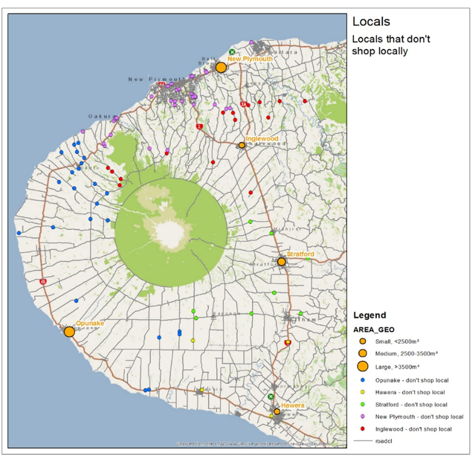
The third map is what happens when you mix information form the first and second map together; it is the opposite of the loyalty map, customers who prefer not to shop locally, and usually do their shopping on an outlet further away from them as their local store is. Usually reasons to this are due to traffic, and sometimes because the local shop does not provide something specific that the customer is after. The interesting areas are the area left of New Plymouth (purple circles), which seem to mean customers go to Inglewood instead, probably because of traffic. The blue dots on further left still all probably go to New Plymouth or Inglewood rather than Opunake, also probably due to traffic.
So, when taking all these analytics into account, are these outlets in the optimized location in the first place? Well, that is what the fourth map shows us: Inglewood and Stratford are pretty much spot on, but New Plymouth and Hawera should move a bit to sort out those traffic issues. The one that is farthest off is Opunake – moving it North some 15 km will resolve the need for the candidate site. Optimizing the site locations would resolve all issues found from the analysis and boost up revenue stream or all outlet locations possibly killing off some of the competition. This is one example of what additional value spatial analytics can bring for one of the industries.
Typically, the next step after this kind of analysis is to prepare some customer segmentation and additional trends, then enable dashboards for business and executives to start monitoring how well outlets are doing (and whether changes recommended were making an impact).
This could be achieved with something like this:
The second map is used to depict outlet loyalty; shopping is colour coded separately for all outlets. Also, bigger the bubble, more the customer spends on the outlet. You can pick the outlet colour by looking at the shopping bubble colour close to the outlets and can then see whether they are always shopping on their closest outlet or somewhere else. Red colour bubbles have been used to showcase customers who show all over the place – and have no specific loyalty to any of the outlets. We can see there is an area left of Hawera where there are a lot of customers (and some quite big ones) that have no loyalty to any specific outlet, probably because of the distance, so this might be another good area for a candidate site.
The third map is what happens when you mix information form the first and second map together; it is the opposite of the loyalty map, customers who prefer not to shop locally, and usually do their shopping on an outlet further away from them as their local store is. Usually reasons to this are due to traffic, and sometimes because the local shop does not provide something specific that the customer is after. The interesting areas are the area left of New Plymouth (purple circles), which seem to mean customers go to Inglewood instead, probably because of traffic. The blue dots on further left still all probably go to New Plymouth or Inglewood rather than Opunake, also probably due to traffic.
So, when taking all these analytics into account, are these outlets in the optimized location in the first place? Well, that is what the fourth map shows us: Inglewood and Stratford are pretty much spot on, but New Plymouth and Hawera should move a bit to sort out those traffic issues. The one that is farthest off is Opunake – moving it North some 15 km will resolve the need for the candidate site. Optimizing the site locations would resolve all issues found from the analysis and boost up revenue stream or all outlet locations possibly killing off some of the competition. This is one example of what additional value spatial analytics can bring for one of the industries.
Typically, the next step after this kind of analysis is to prepare some customer segmentation and additional trends, then enable dashboards for business and executives to start monitoring how well outlets are doing (and whether changes recommended were making an impact).
This could be achieved with something like this:
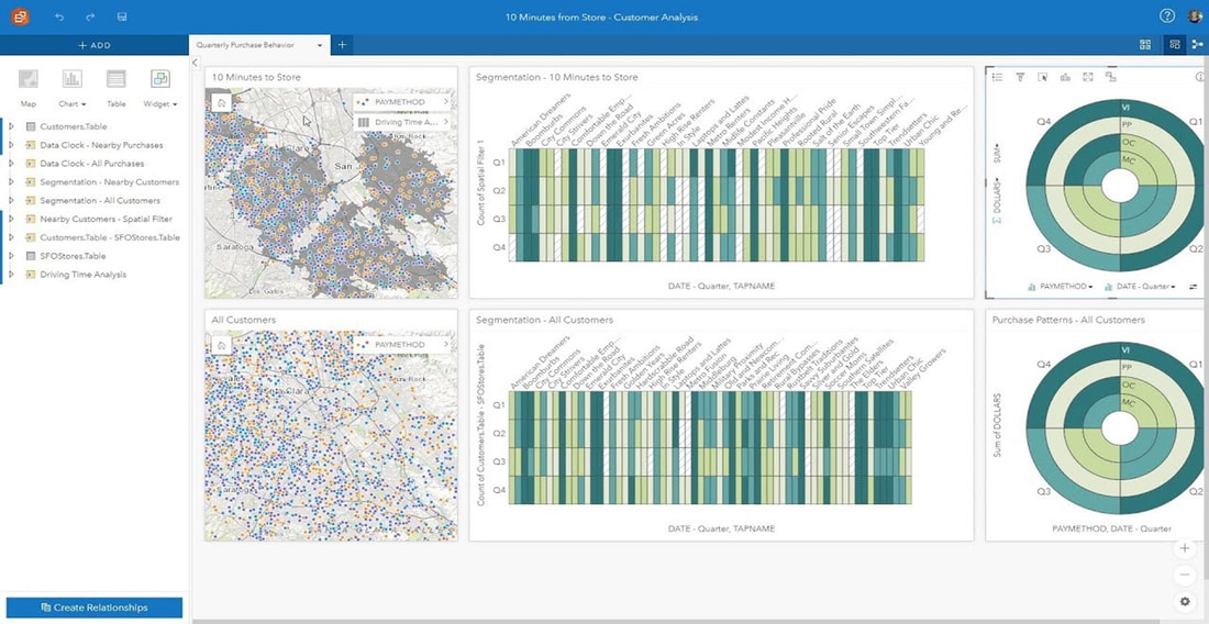
This is a dashboard created with Esri Insights, a template driven Location Intelligence (LI) tool that can be setup and configured by traditional business analysts into the company web browsers to quickly help business report and monitor on customer information. This is a self-service tool that complies with GIS and IT best practices and standards but does not require support from GIS analysts or from IT specialists. With this tool Business can publish their own monitoring and reporting websites either internally, externally or even for the Public.
So, what else could we use spatial for? Let’s look at a couple of more examples:
So, what else could we use spatial for? Let’s look at a couple of more examples:
|
|
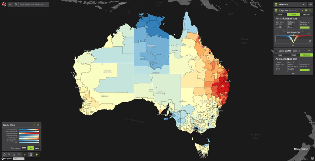
The first map is the Australian Cancer Atlas – a non-specialist analytics tool that can be used to view all types of cancers against demographics like age, gender, ethnicity etc. in geographical areas to see whether location affects the numbers of specific cancer types. It was created as an open source research project together with Frontier SI (Joint Australia/New Zealand Spatial Research Programme) and the code has been shared with Ministry of Health who are apparently working on the NZ version of Cancer Atlas.
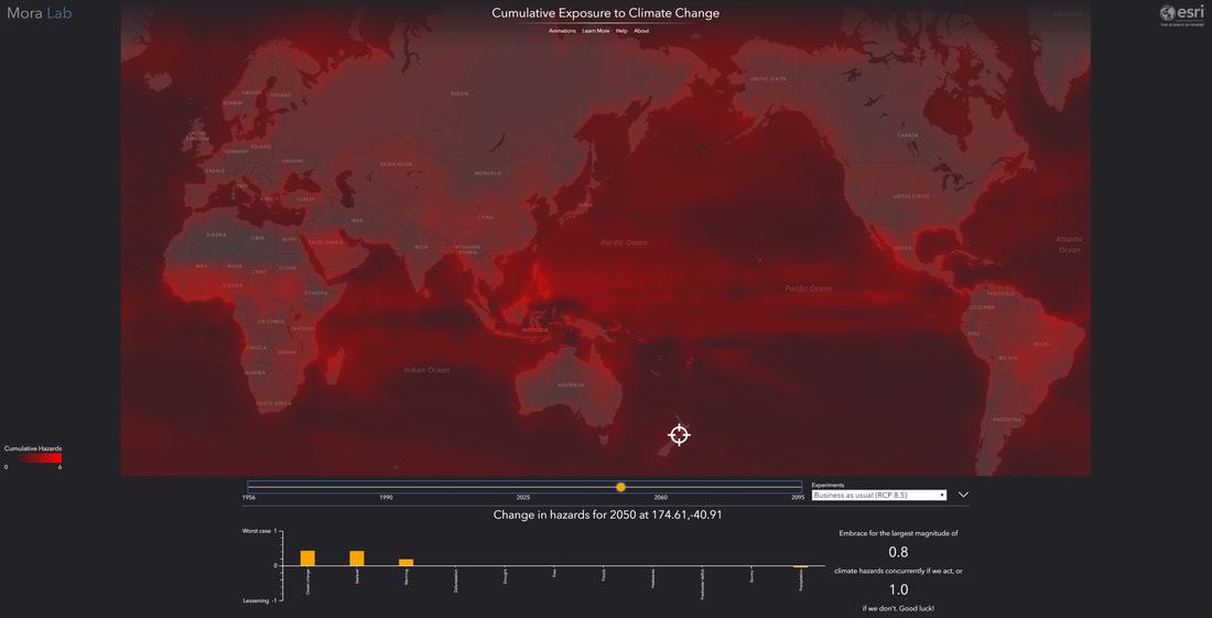
The second map is a time-series (4D) tool to show what the human impact for climate (change) is today on our globe and what we can expect from the future if we do not change our ways. This mapping tool considers some 11 different climate hazards together: global warming, drought, heatwaves, fires, precipitation, floods, storms, water scarcity, sea level rise, and changes in natural land cover and ocean chemistry. You pick up your experiment type, e.g. Strong or Moderate Mitigation or Business As Usual plus a location in the globe and the tool predicts for you the next 80 years of climate change impact with cumulative red shading on the map and a per hazard type impact as well (between -1 and +1). This is a one scary tool and showcases well how badly we have mucked up the weather; just select BAU and use the time series to scroll years forward – it is not a pretty sight, as within 50 years there is an unlivable zone of around 1000 km wide buffering the equator!
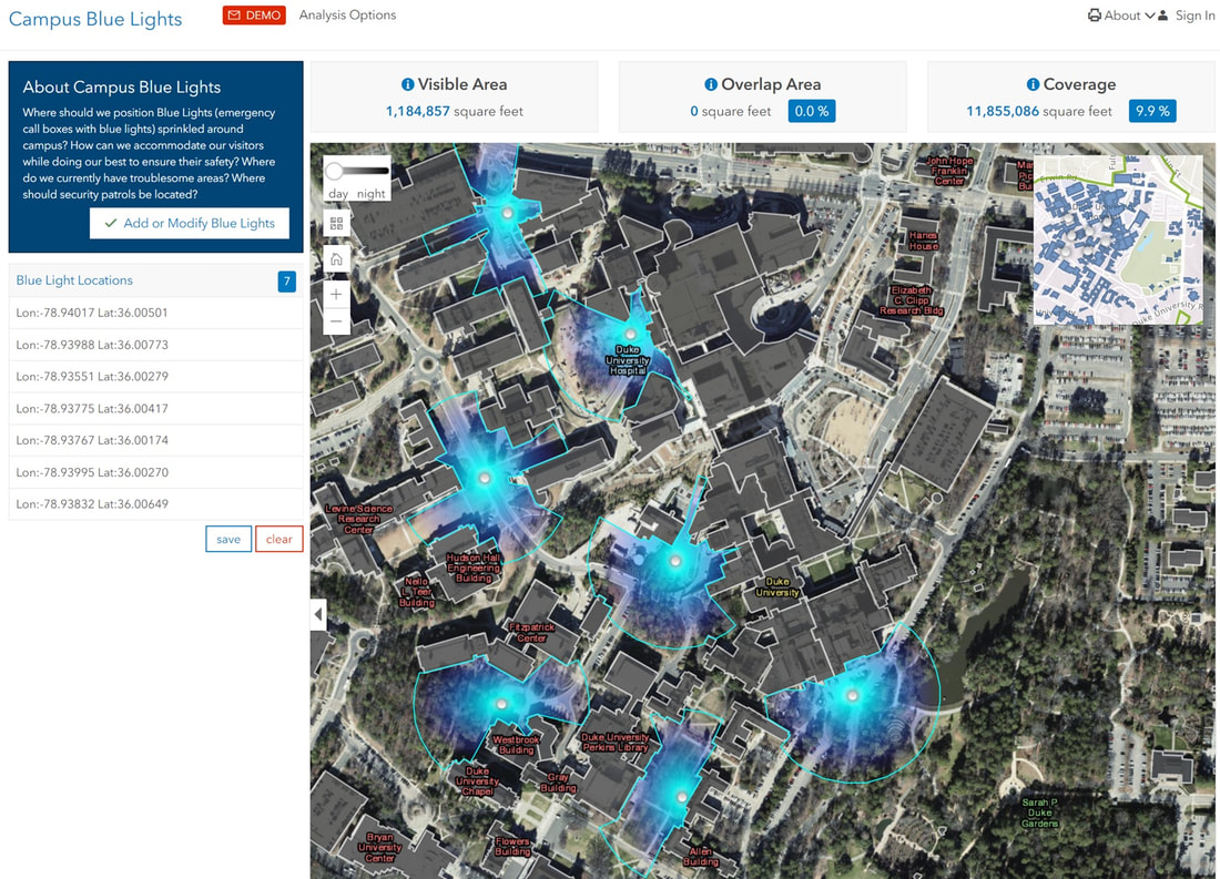
The third map is a Blue Lights play on 3D created for US university campuses; at night-time the emergency boxes in campuses are lighted with a strong blue lamp that casts a wide blue shade that should be visible from all locations for people in need of help. This tool allows users to position additional blue lights in the campus, highlighting how far the light casts a shade. The tool also considers the building outlines and any other obstructions on the line of sight. It is a great little example on how to use 3D.
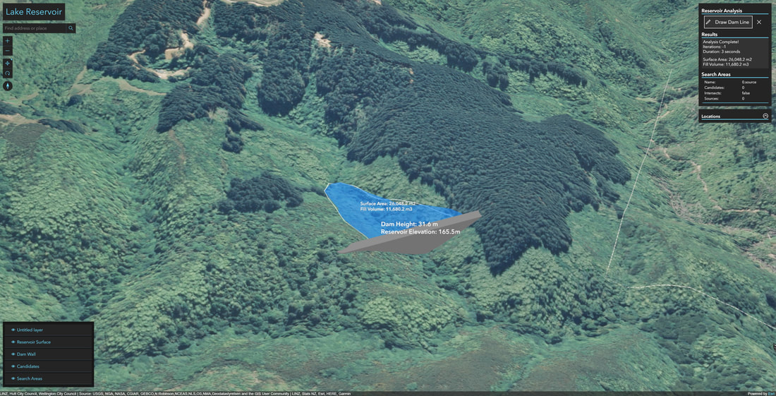
The fourth map is another play with 3D allowing users to build a dam on a given location by drawing a line and then water filling the ground behind the dam. It does not have any real use other than showcasing what you could do with 3D entities and slope and contour. Great food for thoughts considering amount of water we sometimes get after long draughts and brilliant to play with on your own neighbourhood – just navigate to your area of interest (preferably with some hills there) and draw the line to see how deeply the neighbourhood will be flooded.
Of course, there is so much more we can do with spatial:
The second map is a time-series (4D) tool to show what the human impact for climate (change) is today on our globe and what we can expect from the future if we do not change our ways. This mapping tool considers some 11 different climate hazards together: global warming, drought, heatwaves, fires, precipitation, floods, storms, water scarcity, sea level rise, and changes in natural land cover and ocean chemistry. You pick up your experiment type, e.g. Strong or Moderate Mitigation or Business As Usual plus a location in the globe and the tool predicts for you the next 80 years of climate change impact with cumulative red shading on the map and a per hazard type impact as well (between -1 and +1). This is a one scary tool and showcases well how badly we have mucked up the weather; just select BAU and use the time series to scroll years forward – it is not a pretty sight, as within 50 years there is an unlivable zone of around 1000 km wide buffering the equator!
The third map is a Blue Lights play on 3D created for US university campuses; at night-time the emergency boxes in campuses are lighted with a strong blue lamp that casts a wide blue shade that should be visible from all locations for people in need of help. This tool allows users to position additional blue lights in the campus, highlighting how far the light casts a shade. The tool also considers the building outlines and any other obstructions on the line of sight. It is a great little example on how to use 3D.
The fourth map is another play with 3D allowing users to build a dam on a given location by drawing a line and then water filling the ground behind the dam. It does not have any real use other than showcasing what you could do with 3D entities and slope and contour. Great food for thoughts considering amount of water we sometimes get after long draughts and brilliant to play with on your own neighbourhood – just navigate to your area of interest (preferably with some hills there) and draw the line to see how deeply the neighbourhood will be flooded.
Of course, there is so much more we can do with spatial:
|
|
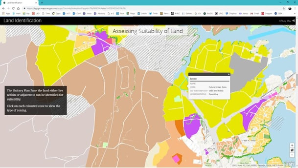
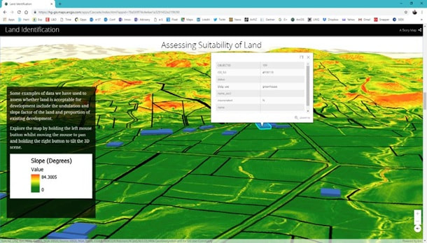
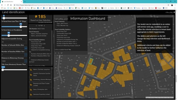
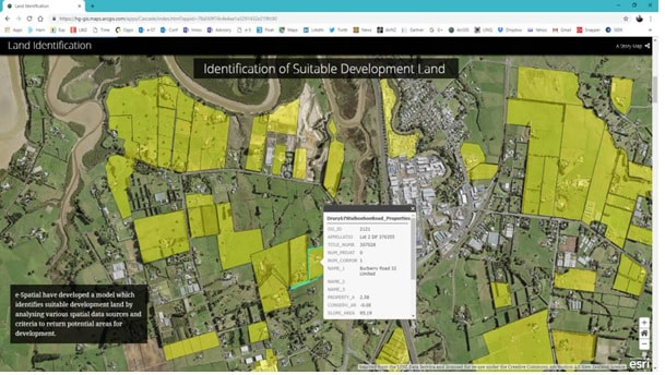
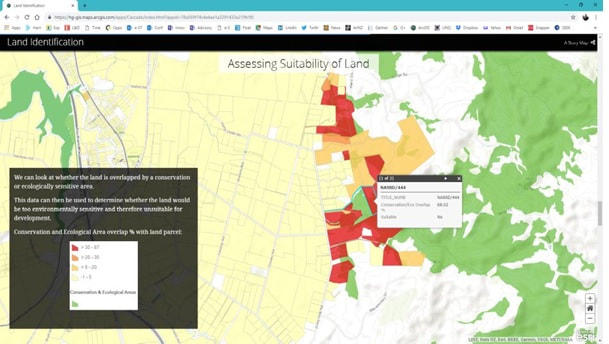
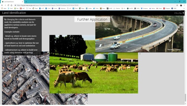
The 6 maps on the left are all from a Story Map; an infographic type of tool using a group of interactive maps that can be used to spin a story on a spatial dataset, or on analysis results, or on a specific project, Or on a company or on an industry profile etc. A great tool for execs, business users or managers, but also useful for sales/marketing teams – e.g. for tendering purposes. You can also provide self service via these kinds of tools – whether it was for internal/ external users sharing sensitive data or for public use/crowd sourcing and open data. |
Spatial is available for all types of users on all industries to create, analyse and publish web maps, web apps and embedded web sites/portals; users can use spatial for enterprise reporting, executive dashboards, shared infographics, business/location intelligence (BI/LI), trend analysis and all kinds of analytics like real time, predictive, big data, customer insights etc.
HANA Spatial
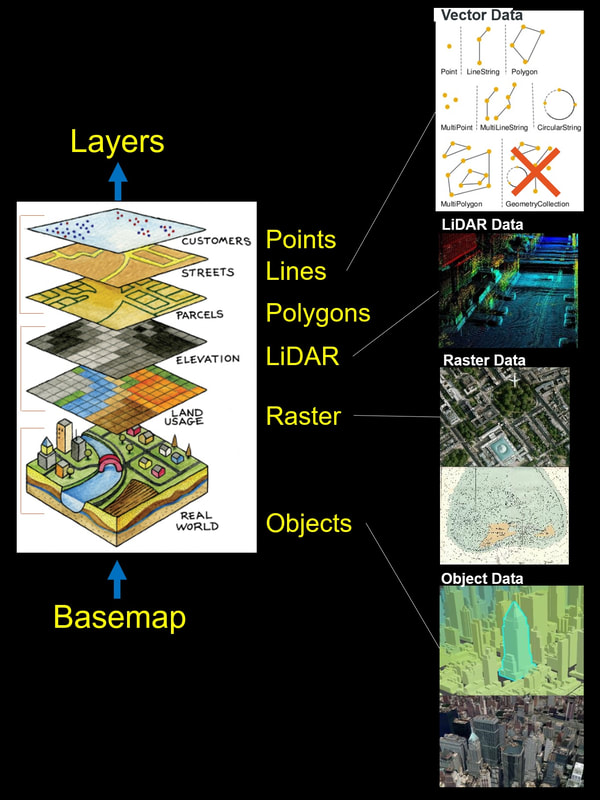
SAP HANA is a natively spatial database. What this means is:
For further specifying the types of data, please consider the following picture:
SAP HANA is a natively spatial database. What this means is:
- HANA can store geospatial geometries (Cartesian-2D – points, lines and polygons) and geographies (Spherical-3D – objects) as a spatial data type field. There can be multiple instances of these fields in a row (like you can have multiple text/number fields on a row).
- HANA includes most OGC-derived (Open Geospatial Consortium is a global standards institute) methods for creating new geometries/geographies and validating them. Also included is a variety of import and export methods.
- HANA can use these spatial data type fields on queries by using methods between data entities. These are typically used instead of relations between relational data types.
- Spatial Measurements: to computes line length, polygon area, the distance between geometries, etc.
- Spatial Functions: to modify existing features to create new ones, for example by providing a buffer around them, intersecting features, etc.
- Spatial Predicates: to allow true/false queries about spatial relationships between geometries, e.g. object overlaps, buffer with contains.
- Geometry Constructors: to create new geometries, usually by specifying the vertices (points or nodes) which define the shape.
- Observer Functions: to query specifics like the location of the centre of a circle.
For further specifying the types of data, please consider the following picture:
|
Implementation of a visual map is a stack:
Alternative view could also be provided with LiDAR point clouds or with other base maps. Note that HANA does not support LiDAR or raster in the database – only in the file system. And even though HANA does support Geometry Collection data type, we recommend not to use it as many GIS systems do not support it. |
So, looking at the database functions and export import functionality (calls) more closely:
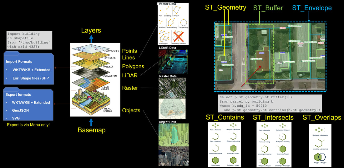
On the left-hand side of the picture we can see that there are a couple of spatial data import/export functions available in the H-SQL:
On the top right-hand side of the picture we show a couple of simple examples on spatial functions:
On the bottom right-hand side of the picture we show combination pairs of some of the common functions:
Let’s look at these methods in a bit more detail – the below diagram includes all commonly used methods in relevant groupings and highlighted whether they can be used for both 2D and 3D objects (yellow text) or just for 2D objects (white text). Note that you cannot mix 2D and 3D objects on queries together, the end results always fail as these are different data types (ST_Geometry and ST_Geography). They are stored in different fields and can only be compared within their own field comparison queries.
- Import – we can bring data through the H-SQL command-line interface using the import clause as per the example in the above picture. HANA can deal with Well-Known-Text (.wkt) and Well-Known-Binary (.wkb) standard formatted data plus with its extended formats and with Esri Shape Files (.shp).
- In the Import clause we load an Esri shapefile with multiple building polygons projected in WGS84 (SRID 4326) - a global latitude/longitude format used by most GIS systems, e.g. Google, Esri, BING, MapBox.
- Export – can only be done via menu in HSS (HANA Spatial Services – Geometry Editor/Geometry Explorer) App. Data can be exported to WKB, WKT (and extended formats), as well as to GeoJSON and to Scalable Vector Graphics (.svg).
On the top right-hand side of the picture we show a couple of simple examples on spatial functions:
- ST_Geometry is a 2D definition of a spatial object (point, line or polygon) – in the example we show two polygon objects: a building and a land parcel (thin solid outline in blue).
- ST_Buffer adds a specified distance buffer around selected 2D object creating a new object. For example, in the picture we have selected a land parcel and applied a 10-meter buffer on it resulting with a new 2D polygon object (a yellow dash-line).
- The example H-SQL clause selects the building 50910 (relational ID match), then finds the land parcel that contains that building and applies a 10-meter buffer on it (yellow dash-line).
- ST_Envelope is typically used to define a brand-new geometry around a given map extent. This is done by providing lower-left and upper-right coordinate-pairs to the function resulting with a new 2D polygon object (the blue dash line).
On the bottom right-hand side of the picture we show combination pairs of some of the common functions:
- ST_Contains can be done between all three vector data types. You select the second entity to find all fully contained first entities, e.g. with last example for selected polygon show all fully contained points. This means that running a contain between two polygons only accepts the first polygons that fully contain the second polygon.
- ST_Intersects is used the same way, but object does not have to be fully contained, it is enough that some of the object nodes intersects each other. Note that there are a lot of other variations like ST_Touches that is very similar but not the same (ST_Touches is a subset of ST_Intersects – for example a line that sinks into polygon returns true with ST_Intersects but false with ST_Touches because the line more than touches the polygon).
- ST_Overlaps is different to ST_Intersects in that if two objects fully overlap each other (like the line is fully inside polygon) then ST_Intersects still returns true, but ST_Overlaps returns false as the line more than overlaps the polygon – it is fully inside (ST_Contains is true).
Let’s look at these methods in a bit more detail – the below diagram includes all commonly used methods in relevant groupings and highlighted whether they can be used for both 2D and 3D objects (yellow text) or just for 2D objects (white text). Note that you cannot mix 2D and 3D objects on queries together, the end results always fail as these are different data types (ST_Geometry and ST_Geography). They are stored in different fields and can only be compared within their own field comparison queries.
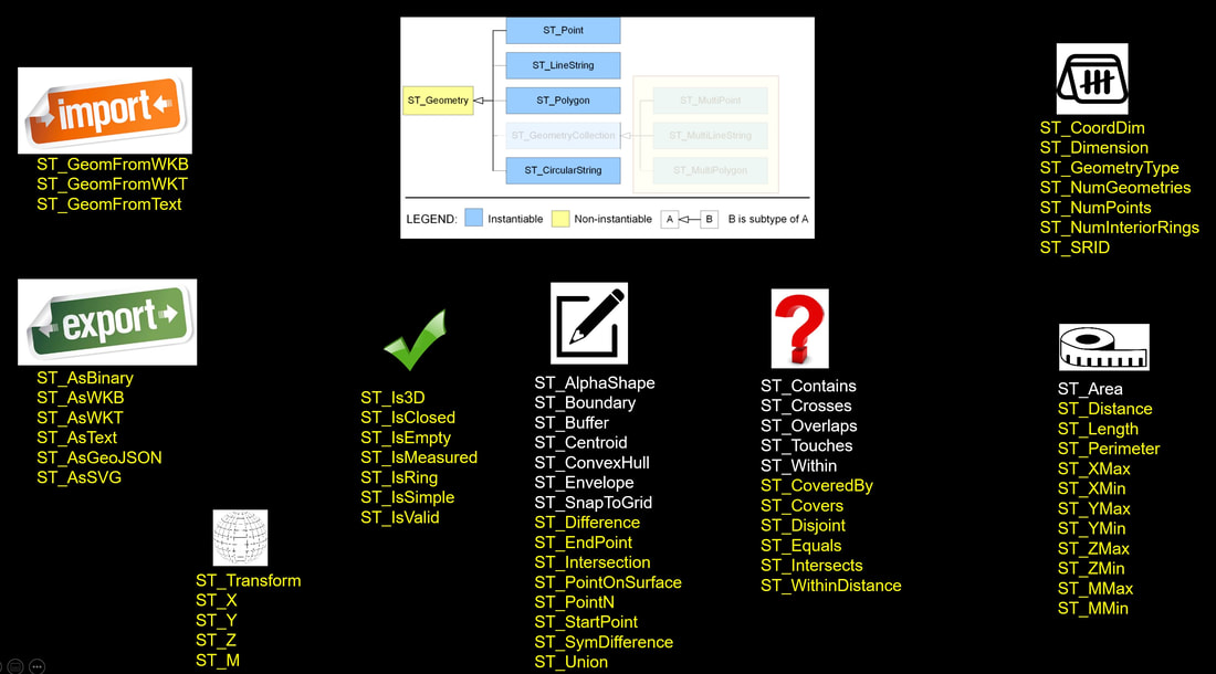
As stated previously we do not recommend you use the ST_GeometryCollection data type (dimmed out in the white box) as this is not supported by many of the existing GIS systems. But if you do use it, note also that it is only supported for 2D objects (ST_Geometry data type).
The 8 group specifications shown above in order (from left to down to right to up):
Let’s next consider the datums, projections and coordinate systems; datums define how coordinates (longitudes and latitudes or heights) relate to physical locations. Projections are different ways of representing a position in a datum, for example as northings and eastings used on topographic maps. Together datums and projections define New Zealand's coordinate systems.
There are two types of Datums in use, Vertical and Geodetic, but for HANA we are in this instance interested on the Geodetic Datums only:
HANA supports all Open Geospatial Consortium SRID projection codes specified by EPSG Geodetic Parameter Dataset, but there are only a few that are relevant for New Zealand:
The 8 group specifications shown above in order (from left to down to right to up):
- You can import spatial objects.
- You can export spatial objects.
- You can move spatial objects between coordinate systems.
- You can check validity of spatial objects.
- You can create new spatial objects.
- You can compare spatial objects within spatial queries.
- You can measure spatial objects.
- You can count nodes/types within spatial objects.
Let’s next consider the datums, projections and coordinate systems; datums define how coordinates (longitudes and latitudes or heights) relate to physical locations. Projections are different ways of representing a position in a datum, for example as northings and eastings used on topographic maps. Together datums and projections define New Zealand's coordinate systems.
There are two types of Datums in use, Vertical and Geodetic, but for HANA we are in this instance interested on the Geodetic Datums only:
- NZGD2000 (New Zealand Geodetic Datum 2000) is in use by most of the New Zealand GIS systems and is recommended by NZ government.
- WGS84 (World Geodetic System) is in use by global GIS systems like Google Maps, BING Maps, ArcGIS Online etc.
- Specific Location Datums
- RSRGD2000 (Ross Sea Region Geodetic Datum 2000) is for Antarctica.
- CIGD1979 (Chatham Islands Geodetic Datum 1979) is for Chatham Islands, but most GIS systems use NZGD2000 for Chatham too.
- Historical Datums
- NZGD1949 (New Zealand Geodetic Datum 1949) – is only used by small number of legacy systems in New Zealand.
- CIGD1971 (Chatham Islands Geodetic Datum 1971) is not in use anymore.
HANA supports all Open Geospatial Consortium SRID projection codes specified by EPSG Geodetic Parameter Dataset, but there are only a few that are relevant for New Zealand:
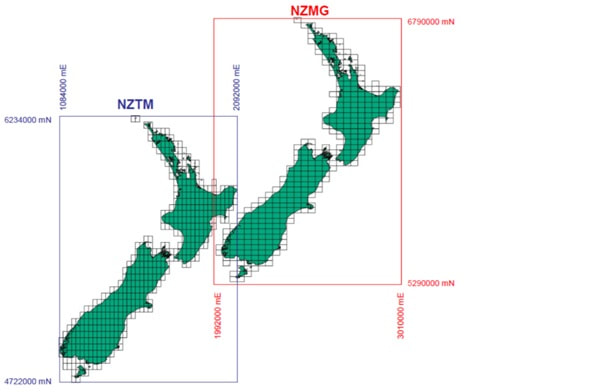
The image above shows the XY metre-range difference between NZMG and NZTM projections.
|
|
HANA supports four coordinates for its coordinate systems:
- X-coordinate (aka Longitude on some projections) –1st Dimension.
- Y-coordinate (aka Latitude on some projections) – 2nd Dimension.
- Z-coordinate – often mean sea level height – 3rd Dimension.
- M-coordinate – used for time series and as other attribute – 4th Dimension.
|
CREATE COLUMN TABLE "MY_SHAPES" (
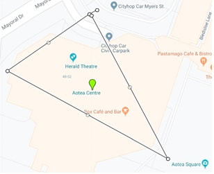
"ID" INTEGER, "PNT" ST_POINT(4326), "GEOM" ST_GEOMETRY(4326)); INSERT INTO "MY_SHAPES" VALUES (1, ST_GeomFromText('POINT(-36.8518211 174.761128)', 4326), ST_GeomFromText('POLYGON((-36.8517478 174.7605057, -36.8513629 174.7616968, -36.8522539 174.7623138, -36.8517478 174.7605057))', 4326)); |
The SQL on the right-hand side creates a spatial table called MY_SHAPES into HANA database and adds one row with an ID (value 1) and two geometries – a centroid point (green symbol) and a triangle polygon. This object is located around the Aotea Centre in Auckland.
The next three pictures show a whole lot more examples from HANA Spatial using relational SQL queries (red text) side by side to prove that spatial SQL is not that different from relational SQL:
The next three pictures show a whole lot more examples from HANA Spatial using relational SQL queries (red text) side by side to prove that spatial SQL is not that different from relational SQL:
|
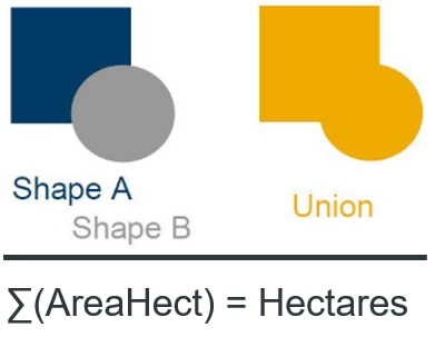
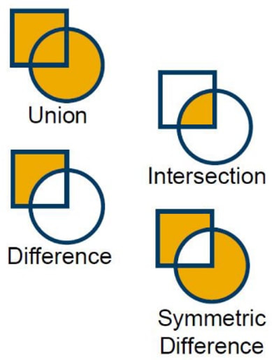
SELECT SUM("AreaHect") AS "Hectares" FROM "MY_SHAPES"; SELECT "Union”.ST_Area(’hectare’) AS "Hectares", "Shape_A".ST_Union("Shape_B") AS "Union", FROM "MY_SHAPES"; The first SQL statement above is relational and sums up all stored hectare counts from MY_SHAPES table. The Second SQL statement is spatial and unions all polygon objects together into one new polygon object and calculates the new objects area in hectares. Some definition on the methods: "Shape_A".ST_Union("Shape_B")
"Shape_A".ST_Intersection("Shape_B")
"Shape_A".ST_Difference("Shape_B")
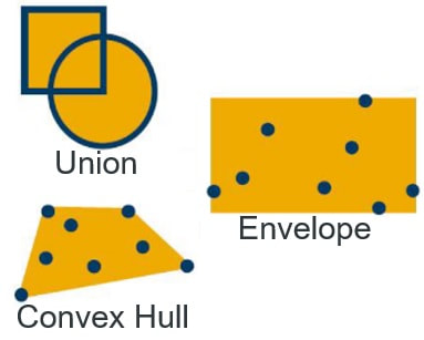
"Shape_A".ST_SymDifference("Shape_B") Removes the intersecting areas of two objects. SELECT "Customer", SUM("Revenue") FROM "MY_SALES" GROUP BY "Customer"; SELECT "Territory", ST_UnionAggr("Geom") FROM "MY_SHAPES" GROUP BY "Territory"; SELECT "MBR", ST_EnvelopeAggr("Geom") FROM "MY_SHAPES" GROUP BY "MBR"; SELECT "Coverage", ST_ConvexHullAggr("Geom") FROM "MY_SHAPES" GROUP BY "Coverage"; This is about different ways of aggregating objects together creating a polygon entity – even when using points. The relational query equivalent is the SUM function (Group By being the selected aggregate type). |
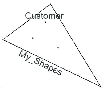
Let’s next consider joining 2 tables; My_Shapes which is a territory boundary table (1 row, ID = 1) and Customer which is a point table (3 rows):
|
SELECT * FROM "MY_SHAPES" AS a
LEFT JOIN "CUSTOMERS" AS b ON a.ID = 1 and b."Territory" = a.ID; SELECT * FROM "MY_SHAPES" AS a LEFT JOIN "CUSTOMERS" AS b ON b."Geom".ST_Within(a."Geom") = 1;
|
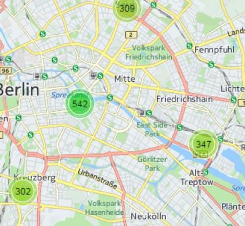
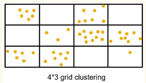
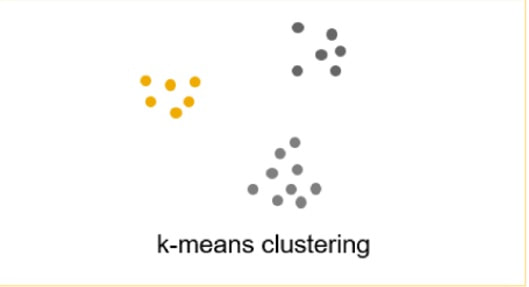
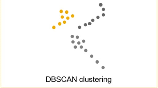
HANA supports clustering point datasets in 3 different ways. With clustering we mean showing a count of points rather than the scattered points on the map. This means there can be a tolerance within map distance when points are deemed to be the same point and summed up to the count. The map below shows an example of clustering, on the right are the example SQL calls and below those calls the actual clustering examples:
|
SELECT ST_ClusterID(), ST_ClusterEnvelope(), COUNT(*) AS C FROM "CUSTOMERS" GROUP CLUSTER BY "LOCATION" USING GRID X CELLS 10 Y CELLS 10; -- #1 SELECT ST_ClusterID(), ST_ClusterCentroid(), COUNT(*) AS C FROM "CUSTOMERS" GROUP CLUSTER BY "LOCATION" USING KMEANS CLUSTERS 10; -- #2 SELECT ST_ClusterID(), ST_ClusterCentroid(), COUNT(*) AS C FROM "CUSTOMERS" GROUP CLUSTER BY "LOCATION" USING DBSCAN EPS 40 MINPTS 50; -- #3 |
|
|
|
For most of the scenarios there the Grid clustering is easiest to use and provides a good clustering experience for the end users.
Why Spatial Queries/Relationships?
We used relational queries above to simplify/explain the spatial queries, but could we get along with just the relational queries? In other words - do we need spatial relationships or are they just a bit of a gimmick?
To better understand the question, we need to consider the following example;
We used relational queries above to simplify/explain the spatial queries, but could we get along with just the relational queries? In other words - do we need spatial relationships or are they just a bit of a gimmick?
To better understand the question, we need to consider the following example;
|
|
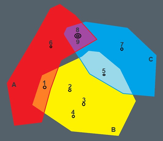
Consider our spatial query:
SELECT * FROM "MY_SHAPES" AS a LEFT JOIN "CUSTOMERS" AS b ON b."Geom".ST_Within(a."Geom") = 1; Result set is 13 combination-rows (A1, A6, A8, A9, B1, B2, B3, B4, B5, C5, C7, C8, C9). (can we) reuse the relational query? SELECT * FROM "MY_TABLE" AS a LEFT JOIN "CUSTOMERS" AS b ON b."Territory" = a.ID; Nope, not without a (new) link table! |
Looking at the picture on left we can see that the polygons do overlap so some points can belong to more than one polygon like point 1 belonging to both polygons A and B. We can also see that even points can overlap each other as multiple instances on same location like points 8 and 9. On the right hand side we can see that the original spatial query will cope with this just fine, but the original relational query fails as it can only relate a point with one polygon, not many.
And this is the core problem – the real-world entities overlap everywhere and even when they do not overlap, the point features can exist on boundaries of polygons and as such way will belong to multiple polygons.
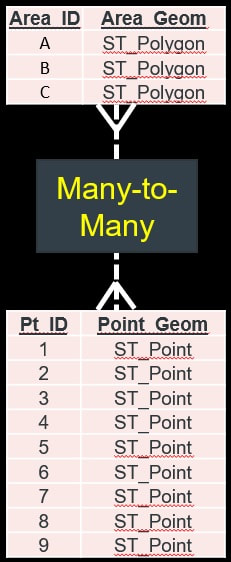
To fix this we would need to introduce a “Many-to-Many” link table for any kind of overlap scenario; the data model in the middle showcases the link table between point and polygon tables, but to make the model real, we would also need link tables for the point and polygon tables themselves (so that points can overlap with points and polygons can overlap with polygons).
So, in the worst case scenario 2 tables would require 3 link tables (5 tables in the model), 3 tables would require 6 link tables (9 tables in the model), 4 tables would require 10 link tables (14 in the model) and so on. As you can se this is a not a linear problem but an exponential one – with 100 tables (which is more typical number of tables for a real-world spatial dataset) we would potentially need over 5000 link tables, with 150 tables the number of link tables is over 11,000! Note that there are local councils that have thousands of spatial tables (I know one with 3,500), so the problem quickly becomes unreal – with the 3,500 tables you would potentially require more than 6.1 million link tables!
So Spatial predicates (like ST_Overlaps) do have their uses 😊
More on this in my next PART 4 blog post of - “PART 4: HANA – Transformation & Access” …
And this is the core problem – the real-world entities overlap everywhere and even when they do not overlap, the point features can exist on boundaries of polygons and as such way will belong to multiple polygons.
To fix this we would need to introduce a “Many-to-Many” link table for any kind of overlap scenario; the data model in the middle showcases the link table between point and polygon tables, but to make the model real, we would also need link tables for the point and polygon tables themselves (so that points can overlap with points and polygons can overlap with polygons).
So, in the worst case scenario 2 tables would require 3 link tables (5 tables in the model), 3 tables would require 6 link tables (9 tables in the model), 4 tables would require 10 link tables (14 in the model) and so on. As you can se this is a not a linear problem but an exponential one – with 100 tables (which is more typical number of tables for a real-world spatial dataset) we would potentially need over 5000 link tables, with 150 tables the number of link tables is over 11,000! Note that there are local councils that have thousands of spatial tables (I know one with 3,500), so the problem quickly becomes unreal – with the 3,500 tables you would potentially require more than 6.1 million link tables!
So Spatial predicates (like ST_Overlaps) do have their uses 😊
More on this in my next PART 4 blog post of - “PART 4: HANA – Transformation & Access” …
